
When I trained as a document production specialist for legal firms, I realized that I had picked up bad Microsoft Word habits over the years. What I learned has since transformed my use of this powerful program. Here are the most important things you should avoid when getting started.
Pressing Enter to Create Gaps Between Paragraphs
When you finish a paragraph, press Enter to move to the next line and start the next paragraph. Sometimes, however, you might notice that there isn’t white space between your paragraphs, meaning it’s difficult to see where one ends and the next begins.
You might be tempted to press Enter again to create that extra space, but this can lead to formatting issues. For example, if you do this at the end of a page, the first line of the next page might not be aligned to the edge of the upper margin as you would expect, meaning your text begins in different places on each page. Also, if you increase the font size across your whole document, this double-space you created might become too large and look untidy.
Microsoft Word has an easy-to-use setting to help you create that elusive white space between your paragraphs. First, though, you might find it useful to see why the paragraphs don’t do this automatically when you press Enter once. Select one of your paragraphs, and click the button in the bottom-right corner of the Paragraph group in the Home tab.
In the Paragraph dialog box that opens, review the Spacing section. If there are no spaces between your paragraphs, it’ll be because either the Before and After options are set to 0 pt, or the Don’t Add Space Between Paragraphs Of The Same Style option is checked.
However, it’s important that you don’t amend those settings yet. If you do, the changes you make will only apply to the paragraph you have selected, and this is very much a short-term fix. Instead, click “Cancel” to close the Paragraph dialog box.
To fix all paragraphs at the same time, you need to modify the paragraph’s style. Single-click any of the paragraphs you have typed, and press Ctrl+Shift+S to open the Apply Styles box. Then, click “Modify.”
You will then see the Modify Style dialog box appear. Click the “Format” drop-down box in the bottom-left corner of that dialog box, and choose “Paragraph.”
This will bring up the same Paragraph dialog box as earlier, but this time, you’re making changes to all paragraphs in this style.
I like to have the paragraph spacing match the font size I am using, as this looks the most professional. So, since I’m using size 12 pt font, I will change the Spacing After to 12 pt. Also, make sure the checkbox underneath is unchecked. Finally, click “OK” in both dialog boxes.
Providing all your paragraphs were assigned to the same style, you will now see that they are all nicely separated, and this will remain the case regardless of where they are in your document. Any additional paragraphs you add will also automatically follow the same structure.
Manually Bolding Your Headings
Now that your paragraphs are nicely spaced, you might want to add a heading.
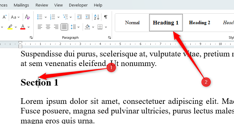
You might be used to selecting the text and pressing Ctrl+B to turn the heading bold, but doing this can lead to nagging inconsistencies and formatting issues. Instead, you need to use the Styles group in the Home tab on the ribbon.
With your cursor placed anywhere in your heading, click a heading style that looks appropriate for your document. In my case, I’ll choose Heading 1.
Doing this has several benefits:
- Word’s heading styles automatically connect your heading to the text that follows, meaning your heading won’t ever separate from the first paragraph of that section. This is great because it means that you won’t end up with a heading at the end of one page and the corresponding text at the start of the next.
- Providing you apply the style to all your headings, if you wanted to change the style, you’d simply need to right-click the appropriate heading in the Styles group and click “Modify.” This would then amend all headings linked to this style.
- If you were to create a table of contents, you can set it up so that it picks up all the headings in your document, a quick and easy way to make sure you don’t miss any out.
- If you format your headings individually, you might forget which settings you applied, meaning your headings might be inconsistent throughout your document.
Using More Than One Font (and the Wrong Font!)
Having worked for many years on professional Word documents for legal firms and schools, one thing I’ve learned is that having more than one font instantly reduces a document’s credibility. The key word throughout this article is consistency, and at no time is this more relevant than when you’re deciding on your font. Yes, you can use different typeface sizes for different headings, bold and italicize some important words, or change the font color, but this should all be done with the same base font.
There are five types of fonts that you have at your disposal:
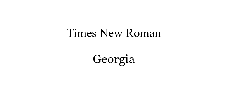
Serif fonts are those traditional newspaper headline typefaces with little flicks at the ends of the lines in the letters, such as Times New Roman or Georgia. While these types of fonts look professional, charities suggest that some neurodiverse individuals might find that they present challenges, as they appear more crowded.
Sans serif fonts do not have these extensions at the ends of the letters and are generally considered more accessible. Examples include Aptos and Calibri.

Script fonts—such as Brush Script MT and Lucida Handwriting—replicate handwriting and are best reserved for digital signatures or stylized documents like invitations.

Monospaced fonts—the default typeface for code editors—make all letters the same width and can be used to replicate traditional typewriter fonts. Here’s what Courier New and Lucida Sans Typewriter look like.

Finally, Display typefaces are used for text that should be used on large displays, and can be any of the above (depending on the typist’s preferences). If you’re aiming for a display typeface, though, you’re probably using the wrong Microsoft program—Publisher and PowerPoint are probably more useful for you!
We hope these tips have been helpful in your business. Please let us know if you have any questions about your IT environment or how to secure it from outside cyber threats. We are here for you! Contact us at (732) 780-8615 or email at [email protected].
Tony Phillips, Excerpt from “6 Mistakes to Avoid When Working on a Word Document”, howtogeek.com, June 27th, 2024