
For many users (and soon, everyone), Slack looks a little different. We’re rolling out a simpler, more organized experience that will help everyone get the most from Slack. But if you’ve used Slack for months (or years), the new look and feel may require an adjustment. That’s natural—quite a bit changed in the interface refresh.
There are a lot of good reasons for this refresh, and we think you’ll love it. To speed up your adjustment period, we put together this quick guide. It will help you find everything you need and give you a few ideas for how to use all the new options.
Search is now in one central spot

The old Slack interface had two different search bars. One just searched for channels and conversations, while the other was for the content of messages and files. Occasionally, you searched using the “wrong” one and you had to re-run your search in the correct area. Confusing, right? Now there’s simply one universal search that automatically runs your query across channels, users, messages and files from a single location at the top of your app.
Try this shortcut: For those of you who use keyboard shortcuts to navigate Slack, ctrl/cmd T or K will still open a search box aimed at channels, and the new keystroke ctrl/cmd G will open a search box focused on message and file content only.
Discover key content atop your sidebar
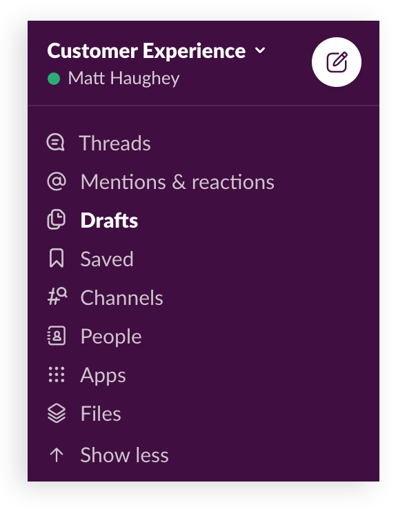
Gone are all the buttons and menus at the top of the app that led you to content like files and a workspace directory. Now there’s a more manageable (and predictable) home for those items atop your sidebar, where you can easily jump between them as needed.
Starred items are now called Saved
In the new list of items at the upper left of the app is Saved (with a new bookmark icon). It used to be called Starred and was located elsewhere, and although you were able to mark either a channel or a message with a star, doing so did different things in the app.
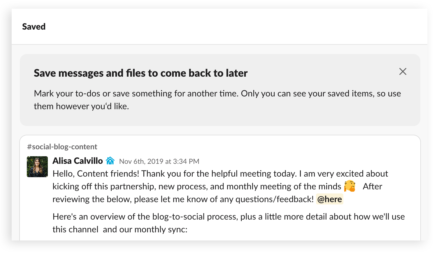
Now it’s a bit clearer: Saved items are the messages and files you want to track privately in your own list located in this menu, and Starred channels will continue to show up under a header in your app’s channels.

You can add any message or file to your Saved list by hitting the bookmark icon that pops up in the action menu when you mouse over a message.
Introducing sections: folders for organizing your channels

Perhaps the most important new feature on all paid Slack plans is custom sections. I can’t emphasize enough how much this can improve your productivity. If having to track a large number of channels has ever overwhelmed you, now you can create any number of descriptive folders to organize (and collapse) them.
My personal setup includes:
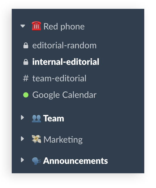
- A top-level “Red phone” or “Top priority” section for my 2–3 absolute most important channels and DMs
- A team section to track my projects and committee assignments
- A section of channels related to my division in the company
- A section dedicated to recurring team- and company-level announcements
Take some time to organize your most vital channels at the top while grouping related channels below with labels that make the most sense to your work. People in sales might create a list of all their accounts and clients and keep them near the top. Software developers can do the same with their own projects and add another collection underneath it for teamwide updates on the codebase.
Mentions & reactions: the new activity feed
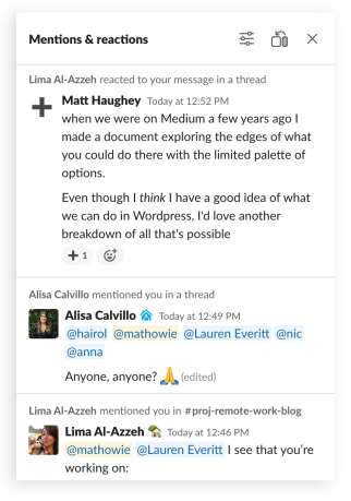
A handy feature from the old Slack interface was the activity tab, which tracked each time you were mentioned by username or received an emoji reaction to your messages. This same info is now neatly folded into the Mentions & reactions section of your sidebar.
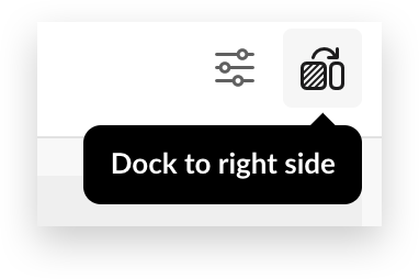
If you prefer to view this on the right side of your app, like the old activity tab, click the icon shown above. This will dock the mentions and reactions feed as you move through channels and other views in the app.
People: your new employee directory
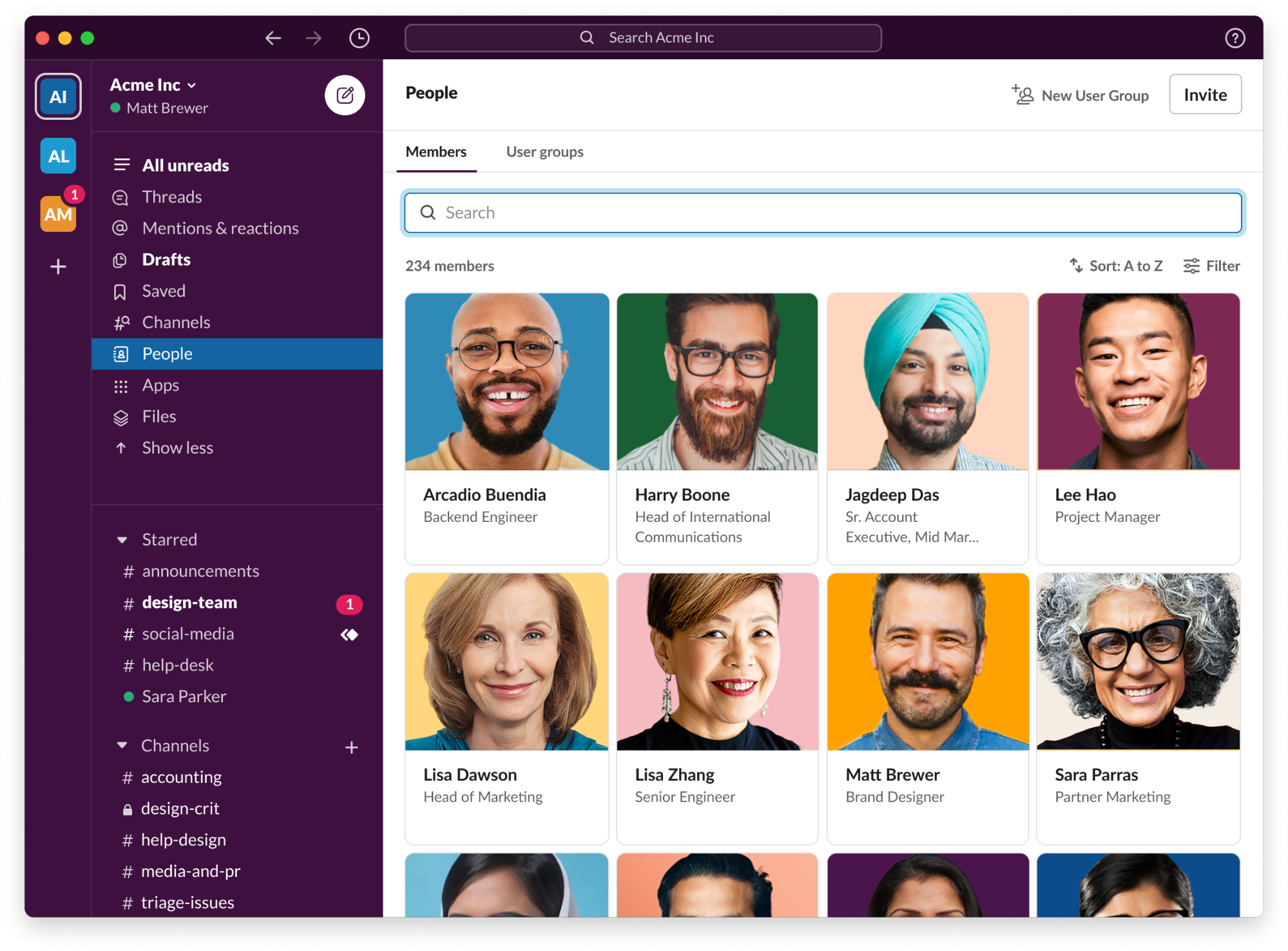
The People view, accessible through your sidebar, is a full employee directory (and when your coworkers upload a profile photo, a fantastic-looking one). Clicking into each profile reveals a flash-card-like bio that will help you get to know your coworkers.
The search box at the top will account for any text mentioned in someone’s profile. So if you need to find your CEO’s executive assistant, a search for “assistant” will likely find the person you need.
History is easier to find
At the top of the app to the left of the search area is a clock icon. This will give you a list of all the recent conversations and channels you’ve seen in Slack. I’ve found myself relying on this feature often. Who sent me a DM right before I left for lunch? Oh right, it’s in my history, four items down from the top.
The adjacent arrow buttons help you move forward and back in your history (much like a web browser), but there’s nothing quite like being able to see your last 10 locations in a single click.
Track your drafts

Use the Compose button to write new messages you don’t immediately have to send. They’ll all wind up in your Drafts list, where you can write out longer ideas in several sessions or test out formatting before you send a big announcement to a group.
Unlike the way Drafts behaved before, when you start a message in a channel but leave it unsent, the channel will no longer move around in your sidebar. Instead, it will remain right where it was, and add a new entry to your Drafts.
Try this shortcut: Hit ctrl/cmd N to create a new draft from the keyboard.
Take more actions from the message composer

The message composer got another refresh too. In addition to the existing message formatting options, you’ll find a new shortcuts menu on the far left and the attachment menu on the far right.

The lightning bolt shortcuts button will give you a list of actions you can take using the apps you’ve installed in Slack. You can run Workflow Builder automations from there as well, and the bolt icon will light up with color when a workflow is available to use in the channel you’re viewing.
Uploading a file, or sharing one from a cloud provider, is done by clicking the paper clip icon on the lower right. While this used to be on the opposite side of the composer, the functionality is still the same.
Try this shortcut: Tap ctrl/cmd U to upload a file from the keyboard.
Haughey, Matt. “A Guided Tour of the Newest Slack Improvements” SlackHQ.com
