Too many spreadsheets. There are just too many, but sometimes you’ve got to have them, so if you’re struggling, we got your back. Need to make a graph in Excel? No problem!
How to make a graph in Excel
Step 1. Select the data you’d like for your graph.
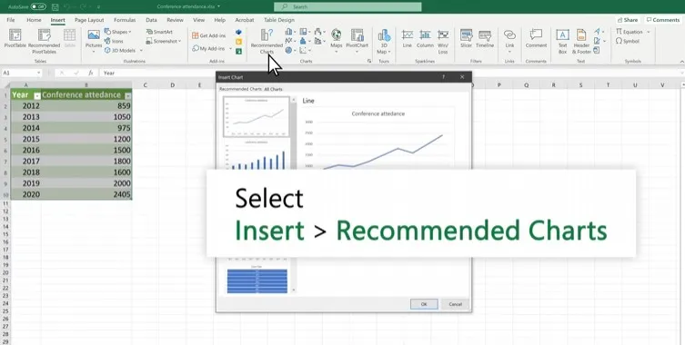
Step 2. Now go to Insert > Recommended Charts.
Step 3. You can select a chart on the Recommended Charts tab to now preview the chart.
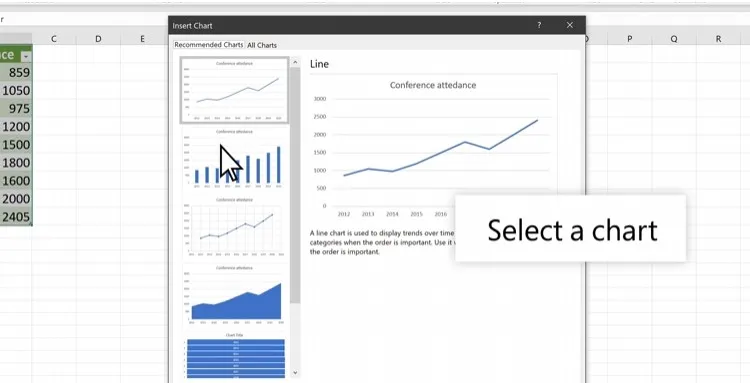
Step 4. Choose a graph.
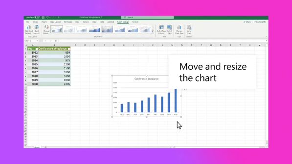
Step 5. Click OK.
It’s really that simple. You don’t have to juggle the Pythagorean theorem to enjoy the wonders of graphs. Don’t go pulling your hair out over Excel. There are plenty of Microsoft Excel tips and tricks to make your life easier.
We hope these tips have been helpful in your business. Please let us know if you have any questions about your IT environment or how to secure it from outside cyber threats. We are here for you! Contact us at (732) 780-8615 or email at [email protected].
Rami Tabari, “How to make a graph in Excel”, laptopmag.com, Oct 10, 2023